BLOG: Designing for Digital Print
This feature was originally published by Images Magazine.
Ensuring your digital artwork is correctly setup can be the difference between a print that wows your customer and one that loses your reputation in a flash. Being able to deliver printed products that hit the mark every time relies on getting the groundwork right and the old adage that “it’s all in the preparation” couldn’t be more true when it comes to generating print files.
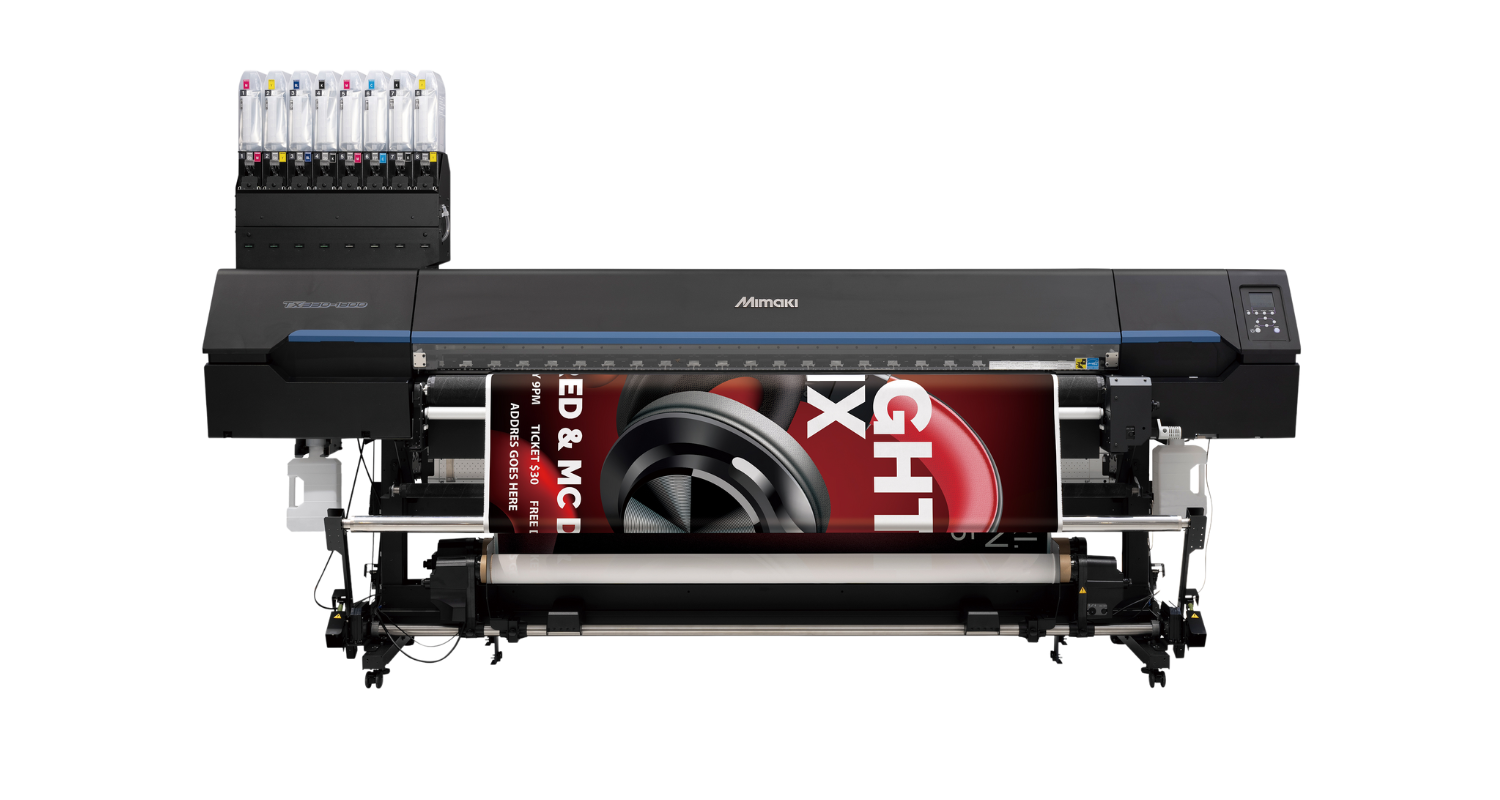
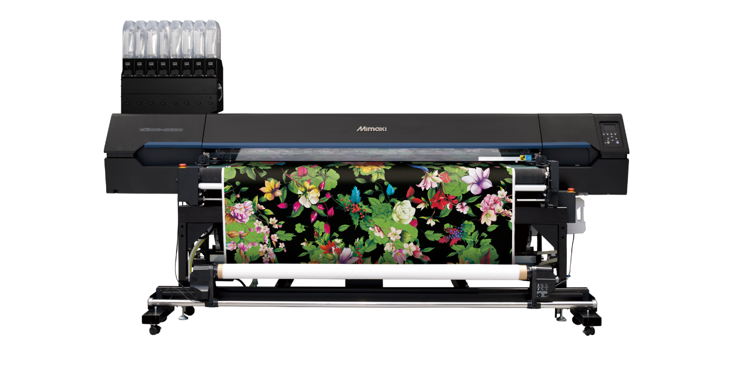
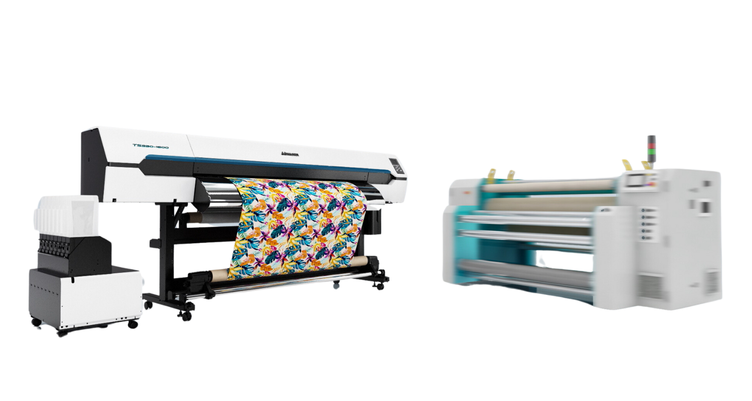
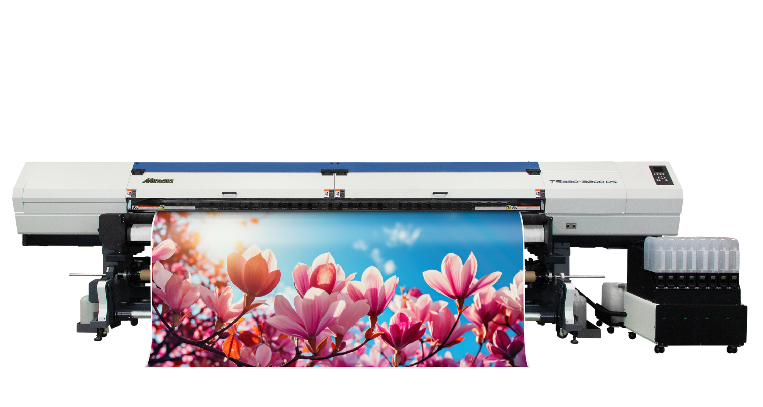
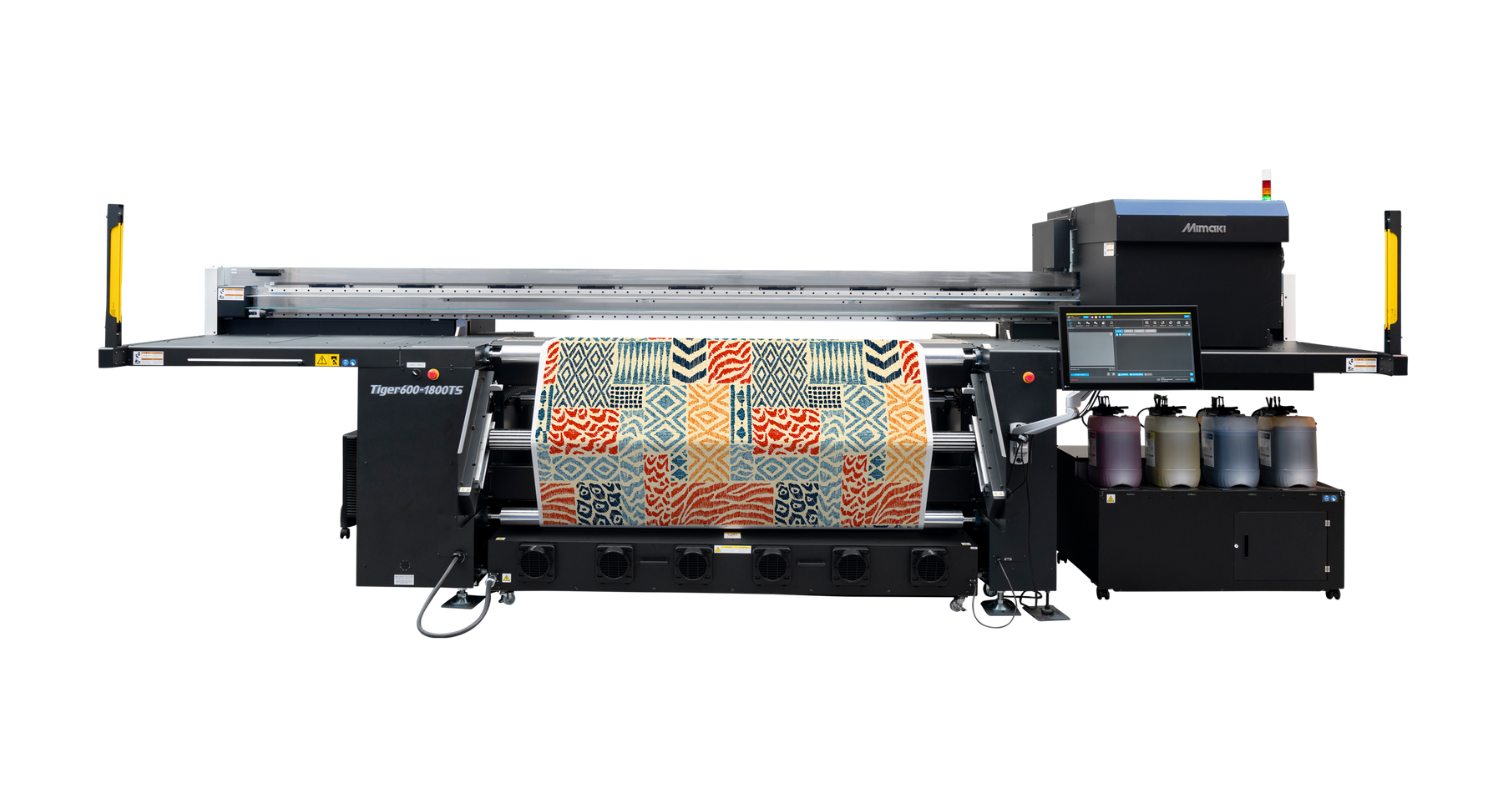
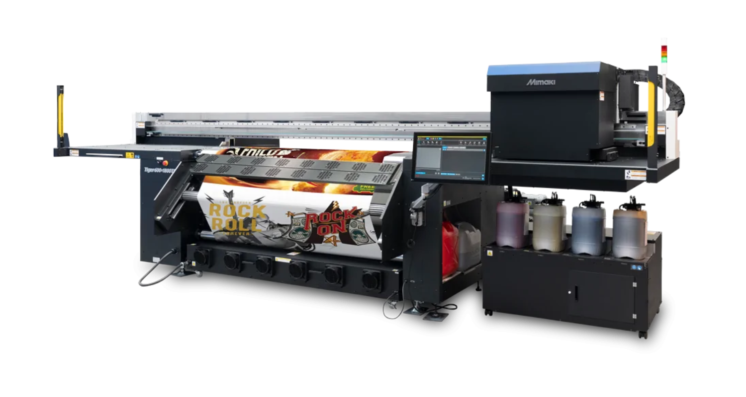
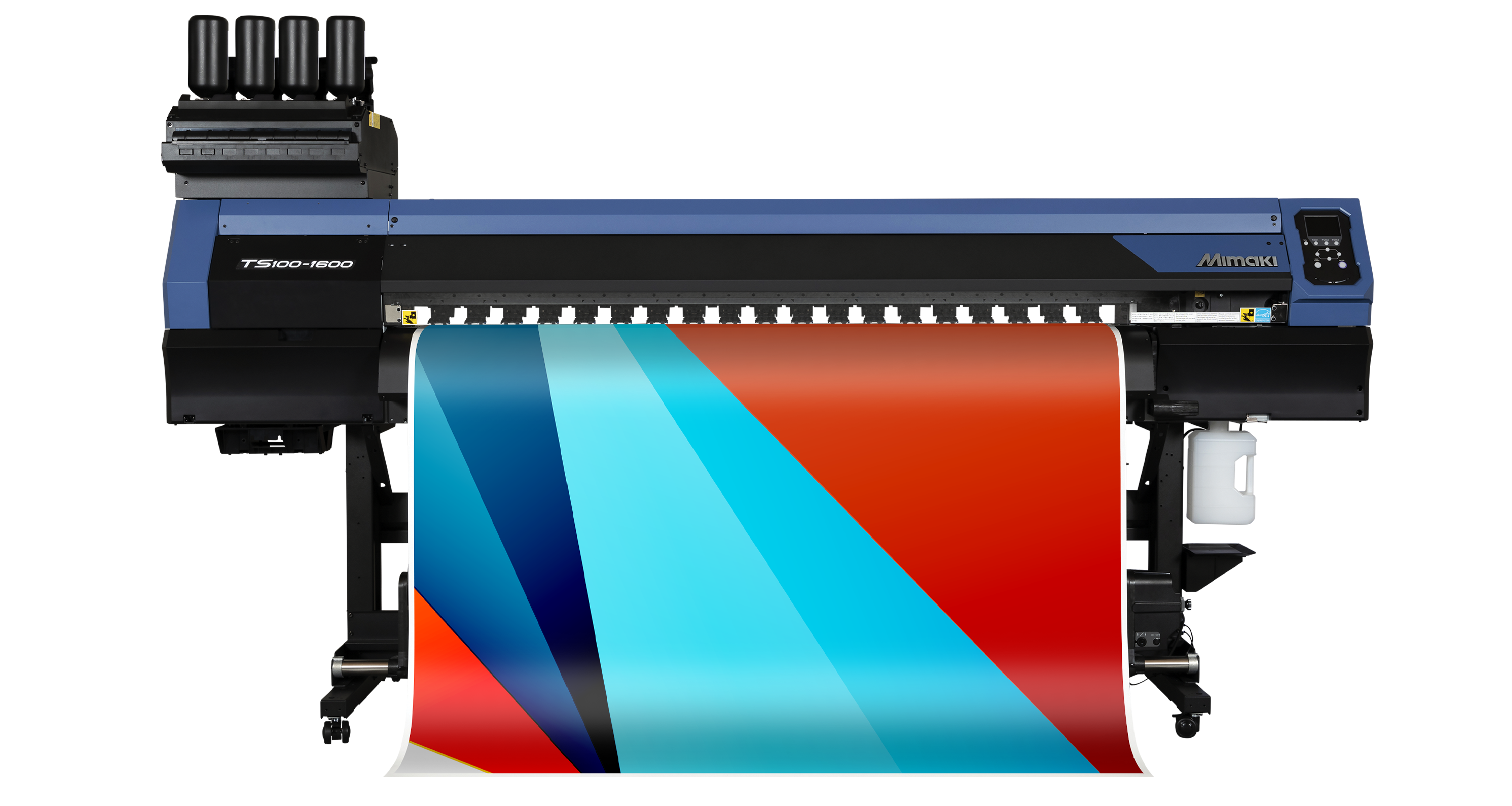
The following examples consider full colour printing on a wide format printer such as a Mimaki TS100-1600 dye sub model or a Tx300P-1800MkII direct to fabric solution, and assume using design creation software such as Adobe Illustrator or CorelDRAW before putting the file through a RIP in order to send the design to the printer.
File Creation
There are a number of key elements to tie down in your artwork and it’s for this reason that busy design studios will have some form of checklist or ‘sign-off sheet’ that accompanies each job. During the artworking process, the designer will tick off key elements that collectively ensure best practice has been adhered to when preparing the file for print. These will include some or all of the following:
Images & linked files
When constructing complex designs, it’s good working practice to link (rather than embed) image files in applications such as Adobe Illustrator. This allows the designer to edit the original image and for changes to take place in the final file automatically. If those links break, a low res preview could be left, causing a loss of quality in the final result, so it’s important to ensure they’re present and correct when saving the final file.
Good quality, print ready images
The bigger the final result, the bigger and higher quality the artwork needs to be. It sounds simple, but when clients request a 10ft feather flag based on the logo on their business card, scanning it in won’t cut the mustard. Vectored logos, 300dpi images and CMYK colour images all lead to a better final result, with sharp edges, accurate colour reproduction and images that won’t pixelate when reproduced at size.
For really big work (grand format retail graphics, hoardings and vehicle wraps, for example) any original photographic elements required will need to be both high resolution (minimum 300dpi) and a large physical size in order to cope with being enlarged when printed. Some elements will be more demanding than others, and where it’s not possible, there are techniques that can be incorporated into the design to help hide the more challenging parts, but starting big in order to go big will make all the difference to the final result.
Artwork size
With soft signage, flags and other large graphics that require elements of finishing (trimming, eyeleting or welding), it’s important to factor in bleed and ‘safe’ areas that will be taken up with hardware or lost altogether as they’re trimmed or otherwise obscured. Using guides and crop marks in the original artwork will help to keep the main design message uninterrupted, but if you’re not designing at 100%, don’t forget to scale these areas into the artwork too. For example, a 50mm hem area will be represented as 12.5mm bleed on the artwork if you’re working at 25% and upsizing in the RIP.
Alignment
Does everything look right on the design? Not “about right”, but really right. Using inbuilt alignment tools to ensure key design elements are perfectly positioned to each other will ensure a sharp, professional result and it’s easy to miss in the rush to finish a design. Check spacing around logos complies with corporate guides, check safe areas around the margins and double check everything’s as you planned it in relation to other elements before saving the final file.
Colour management
Whilst your RIP will be used for ensuring the correct profile is used when printing the file, preparing it properly at the outset is important too. Double check any corporate colours and their CMYK breakdowns are correct and that photographic images have been created in CMYK too. This will lead to a reduced chance of any variation when printed, and help the RIP do its job too.
Spelling & typography
Turn on spellcheck in your design software by all means, but accompany this with a proper, quiet and focussed look over any written copy. It’s easy to get buried in a job and not see mistakes hidden in plain sight, so wherever possible, a fresh pair of eyes from a colleague can make all the difference. If your copy incorporates body copy, check names are spelt correctly, any team kits are properly numbered up, and ensure important typographical aspects like kerning, hyphenations, widows and orphans have been attended to. The time to change it is now, not when it’s been printed!
Lastly, once the text has been approved, remember to outline it to ensure it scales correctly and doesn’t get substituted or lost in processing.
Cut paths
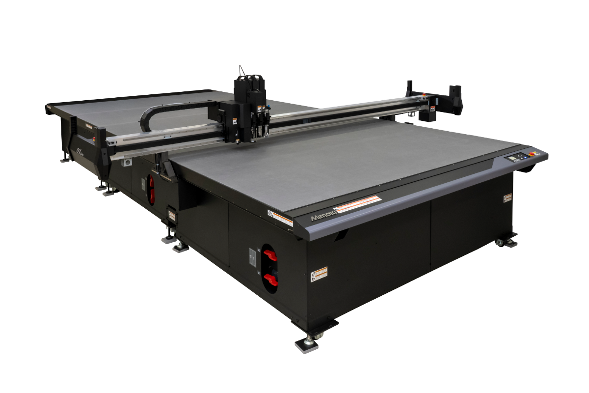
If you’re design will be printed and cut – such as decals or shaped transfer paper prints – denoting the path that the cutting plotter will use should be done at this time too. In Illustrator and CorelDRAW (most manufacturers will provide a plugin to work with these programs, such as the Mimaki’s FineCut software) including a new layer in the artwork containing a vector path is all that’s required. The RIP software will allow the operator to choose which layer gets printed and which layer’s data is used to cut from, but packaging the two together allows the process to be automated and, ensures elements of the job don’t get lost in transit.
Final file format
Lastly, when you save your file, make certain it’s both high quality and in a format that’s compatible with the RIP software. Don’t use a format that compresses the file so much it compromises quality, or that’s going to throw up errors when it’s processed by the RIP – so it’ll likely be a high quality JPEG, an EPS or PDF that’s in the necessary format for the RIP to accurately reproduce.
Good RIP Practice
With the file ready to go, it’s time to bring it into the RIP. A RIP (Raster Image Processor) translates the design information and communicates it to the printer in a format it can understand, whilst applying a profile that optimises the combination of ink, media and other print requirements.
When preparing the print file in the RIP, a number of additional checks and processes can be carried out. If a design is being transfer printed, it’s at this point it should be mirrored, resulting in a ‘reverse print’ onto the paper (to allow it to flip again upon transferring to the garment in the heat press). Using the RIP to mirror the artwork is a simpler way to work than mirroring the original – it takes a special talent to proof text that’s been written backwards!
RIPs such as Mimaki RasterLink enable spot colours to be used – for example fluorescent inks in certain Mimaki dye sublimation printers – so where a special colour has been used in the design process, it will tie in with a colour library in the RIP. If a job requires multiple prints, the RIP is the place to drive this requirement too. It will allow the user to choose the number of copies and cleverly nest them on the media to save costs and time. Again, it’s good practice to use the RIP to create multiple copies, as a single original file will be smaller and easier to move around.
Last but not least, applying the correct profile for the inkset and media – as well as the print speed required will result in a final job befitting of the hard work that’s gone in to get it this far. It’s often easy to forget how much effort goes into delivering a print that looks great, is right first time and delights the client, but following good practice and checking everything before you press ‘print’ is a very good place to start.


